
The birth story of Pepsi
Pepsi, the biggest rival for Coca-Cola, is one of the most famous beverages worldwide. However, there is a lot of hard work behind its success. The original formula of Pepsi started in the humble place of New Bern, North Carolina. It was invented by local pharmacist Caleb Bradham known as ‘Brad’s Drink’ in 1893. He started selling Brad’s Drink inside his pharmacy. As the drink’s popularity increased, he named his drink ‘Pepsi-Cola,’ the catchy name we know today (www.pepsiborninthecarolinas.com, n.d.)
In fact, the Pepsi logo contributes immensely to its beverage popularity rather than the logo becoming famous due to its beverage popularity.
The transition of the Pepsi logo from past to present (1898-2021)
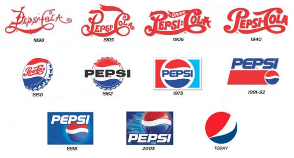
1898-1940:
From 1898 to 1940, the logo had been illustrated by a red font with a long wavy line linking the letter ‘P’ with ‘C.’ The colours’ ‘red’ and ‘white’ had been major colours for the brand for 40 years. The cursive script prevailed amongst the companies’ logo-making during the period.
1950:
In 1950, the CEO of Pepsi came up with the idea of inserting its logo onto the beverage bottle cap. As a result, the round shape of today’s well-known logo comes from this idea. The significant difference in its design from the past is the change in not only the shape but also colours; they added blue into the design. Pepsi pursued two objectives – to differentiate from the best rival Coca-Cola and show support to the armies of the United States in World War II since the US flag consists of red, white, and blue colours.
1962:
During the 1960s, Pepsi also made a huge change to its logo; the word ‘Cola’ disappeared from the design.
1973:
In the 1970s, people were embracing modernity and innovative technologies, impacting the Pepsi logo. Pepsi adopted minimalism, making its logo neat and clear.
1998:

1998 was a special year for the company: 100th anniversary. To honour the achievement of Pepsi, they changed their logo design. The blue colour was used to stand out the word ‘PEPSI,’ and the shade was added to make the logo looks 3D which fits perfectly with modern society.
What does the recent Pepsi logo express? (Why was the logo update necessary?)
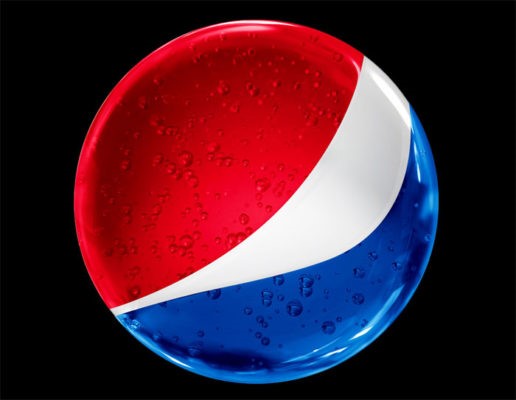
This logo has been used from 2008 until the present. The creators used red, blue, and white colours and tweaked the middle white space to represent the logo with a smiling face, making it looks appealing. Surprisingly, Pepsi paid $1 million to create the new logo. As evidence of Pepsi’s passionate approach towards creating its logo, the PDF of a work in progress document provided by the Arnell group is available on the internet. It contains 27 pages of the draft of designs (Arnell group, 2008). In this new logo design, the creators took the Parthenon temple, the Mona Lisa, golden ratio, the theory of relativity, magnetic field, etc., into consideration to design the logo. At first, the world perceived this as a ridiculous idea, yet it turned out to be a great success.
Pepsi changed its logo to adapt to the evolving society. As you can see, the company’s logo plays a huge part in its triumph since it best represents its brand.
Reference
www.pepsiborninthecarolinas.com. (n.d.). History of Pepsi-Cola | Pepsi Cares. [online] Available at: https://www.pepsiborninthecarolinas.com/history.
Arnell group. (2008). BREATHTAKING Design Strategy. [online] Available at: https://jimedwardsnrx.files.wordpress.com/2009/02/pepsi_gravitational_field.pdf.